The world is warming despite natural fluctuations from the El Niño cycle.
In 2024, the world was around 1.5°C warmer than it was in pre-industrial times.1 You can see this in the chart below, which shows average warming relative to average temperatures from 1861 to 1890.2

Temperatures, as defined by “climate”, are based on temperatures over longer periods of time — typically 20-to-30-year averages — rather than single-year data points. But even when based on longer-term averages, the world has still warmed by around 1.3°C.3
But you’ll also notice, in the chart, that temperatures haven’t increased linearly. There are spikes and dips along the long-run trend.
Many of these short-term fluctuations are caused by “ENSO” — the El Niño-Southern Oscillation — a natural climate cycle caused by changes in wind patterns and sea surface temperatures in the Pacific Ocean.
While it’s caused by patterns in the Pacific Ocean and most strongly affects countries in the tropics, it also impacts global temperatures and climate.
There are two key phases of this cycle: the La Niña phase, which tends to cause cooler global temperatures, and the El Niño phase, which brings hotter conditions. The world cycles between El Niño and La Niña phases every two to seven years.4 There are also “neutral” periods between these phases where the world is not in either extreme.
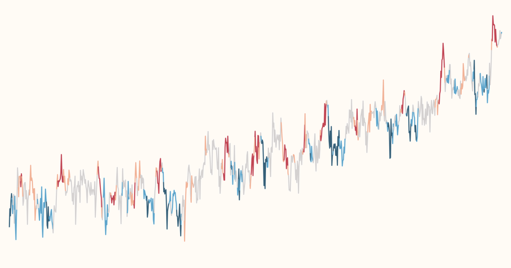
The zig-zag trend of global temperatures becomes understandable when you are taking the phases of the ENSO cycles into account. In the chart below, we see the data on global temperatures5, but the line is now colored by the ENSO phase at that time.6
The El Niño (warm phase) is shown in orange and red, and the La Niña (cold phase) is shown in blue.
You can see that temperatures often reach a short-term peak during warm El Niño years before falling back slightly as the world moves into La Niña years, shown in blue.

What’s striking is that global temperatures during recent La Niña years were warmer than El Niño years just a few decades before. “Cold years” today are hotter than “hot years” not too long ago.7
Continue reading on Our World in Data
Climate Change
How are global temperatures changing, and what are the impacts on sea level rise, sea ice, and ice sheets?
How much have temperatures risen in countries across the world?
Explore country-by-country data on monthly temperature anomalies.
More people care about climate change than you think
The majority of people in every country support action on climate, but the public consistently underestimates this share.
Cite this work
Our articles and data visualizations rely on work from many different people and organizations. When citing this article, please also cite the underlying data sources. This article can be cited as:
Veronika Samborska and Hannah Ritchie (2025) - ““Cool” years are now hotter than the “warm” years of the past: tracking global temperatures through El Niño and La Niña” Published online at OurWorldinData.org. Retrieved from: 'https://ourworldindata.org/global-temperatures-el-nino-la-nina' [Online Resource]BibTeX citation
@article{owid-global-temperatures-el-nino-la-nina,
    author = {Veronika Samborska and Hannah Ritchie},
    title = {“Cool” years are now hotter than the “warm” years of the past: tracking global temperatures through El Niño and La Niña},
    journal = {Our World in Data},
    year = {2025},
    note = {https://ourworldindata.org/global-temperatures-el-nino-la-nina}
}
Reuse this work freely
All visualizations, data, and code produced by Our World in Data are completely open access under the Creative Commons BY license. You have the permission to use, distribute, and reproduce these in any medium, provided the source and authors are credited.
The data produced by third parties and made available by Our World in Data is subject to the license terms from the original third-party authors. We will always indicate the original source of the data in our documentation, so you should always check the license of any such third-party data before use and redistribution.
All of our charts can be embedded in any site.