
Walking through the New York Art Book Fair this past spring, I pointed out a few favorites to a friend, including Janelle Rebel’s Bibliographic Performances & Surrogate Readings (The Everyday Press, 2024) and Bindi Vora’s Mountain of Salt (Perimeter Editions, 2023). My friend observed that I had a preference for smaller volumes. While Rebel’s book is 352 pages and printed on thin, lightweight paper reminiscent of photocopied research notes, Vora’s photobook tallies just under 450 pages. Mountain of Salt uses heavier paper stock but is airier, filled with white pages peppered with black-and-white found photographs printed at the scale of smartphone images and with large bold lines of text. Both are 7 1⁄2 inches tall by less than 6 inches wide, making them easy to flip through, slip in a tote bag, and skim on the subway ride home.
Small books are in. There is both an intimacy and an air of rebellion to small books (think diaries, underground zines, manifestos). Without a doubt, the content of a book determines its scale. “It’s mostly a gut feeling, whether I choose a smaller or larger size,” says Cécile Poimboeuf-Koizumi, founder and primary designer of the Marseille-based publishing house Chose Commune. Jeux de mains (about 5 by 6 1⁄2 inches), a 2022 book filled with images of hands, is based on the size of Poimboeuf-Koizumi’s own hand.
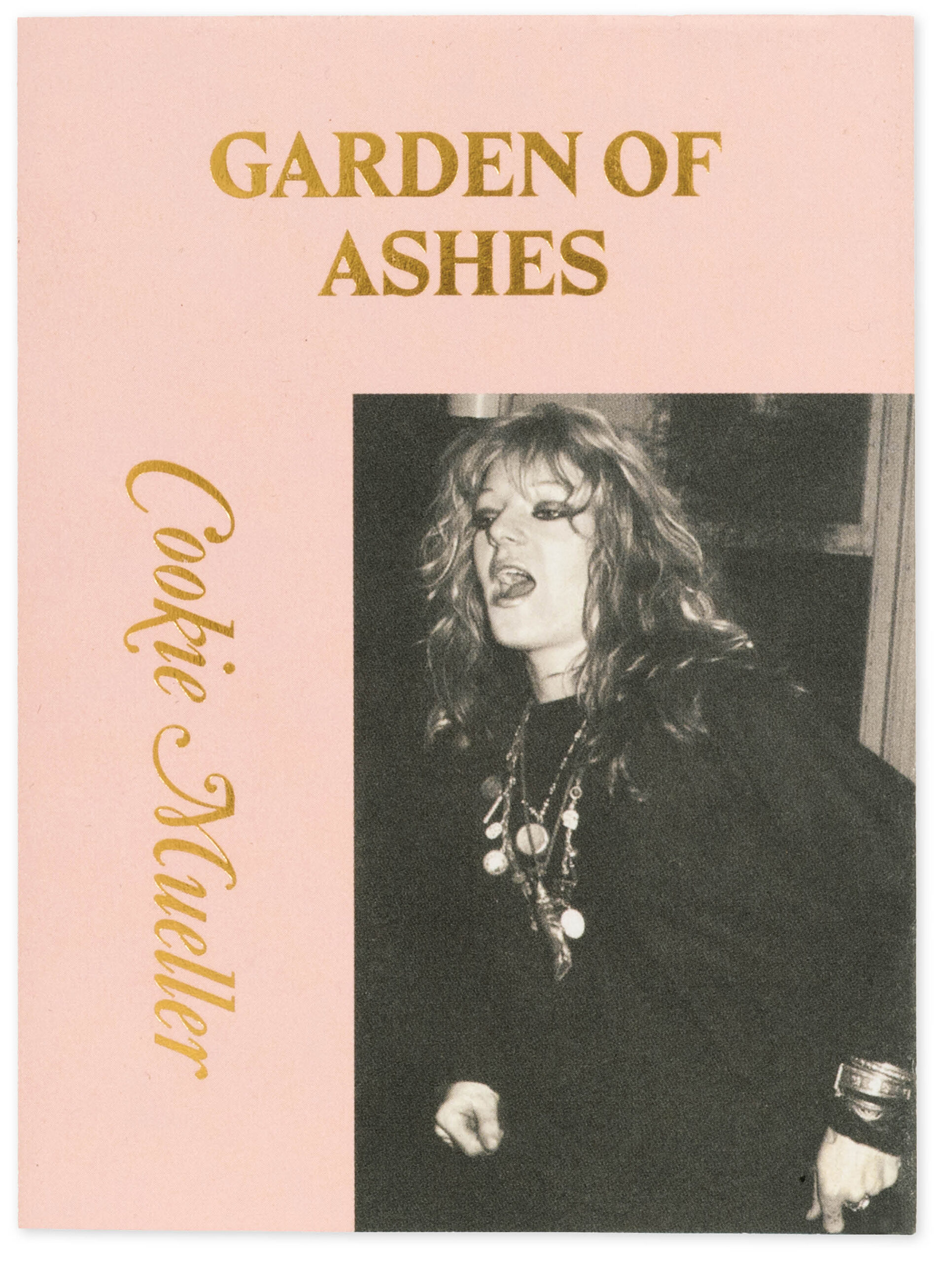
Cover of Cookie Mueller, Garden of Ashes (Hanuman Editions, 2024)

Spread from Bindi Vora, Mountain of Salt (Perimeter Editions, 2023)
Or consider Hanuman Editions, the recent reboot of Hanuman Books, an imprint founded in the mid-1980s. All the books are 2 by 2 inches, with a simple cover design and gold lettering. Originally, the “playful kitsch” size referenced a book of chants to the Hindu god Hanuman, but the books also fit in our back pockets, much like our smartphones.
Those dopamine dispensers have undoubtedly influenced the rising popularity of small books, especially photobooks. “Everything is filtered through our screen or phone,” says the book designer Brian Paul Lamotte. “We’ve kind of consciously become more and more comfortable with seeing imagery smaller. And we’re also reading things on our phones. So the jump to things being printed in that scale isn’t really so drastic.” Over the years, Lamotte has designed books at a range of scales, but recently, he’s been drawn to making and collecting smaller tomes.
Aperture Magazine Subscription
0.00
Get a full year of Aperture—the essential source for photography since 1952. Subscribe today and save 25% off the cover price.
In 2021, Bruno Ceschel’s SPBH Editions launched its Essays series, designed by Lamotte. These slim white volumes are all the same size (about 4 by 6 inches) and have the same cover design of black sans serif type on a white backdrop. The series’ latest entry, Charlie Engman’s Hello Chaos, a Love Story, published in March 2024, revels in screen culture, deploying text-message bubbles and layered screenshots. Though small, this book is thick (182 pages) and feels similar to holding a phone—unlike one of the earliest titles in the series, Carmen Winant’s Instructional Photography: Learning How to Live Now (2021), which clocks in at 120 pages and is much smaller than many of her large-format photobooks. The size of the book matches the conversational tone of the text, an open-ended manifesto about how-to photography’s potential to deepen self-understanding.
“Carmen was commissioned based on a lecture,” Ceschel explains. “I suggested making it into a visual essay.” Lamotte’s design gives the book a literal weight but also suggests it can be read in one sitting.
Scale is more than height, width, and page count. When TBW Books founder and creative director Paul Schiek is designing a book, he thinks of “constant Venn diagrams in my head: What size, what color paper, what kind of printing, what price point do we want the book at?”
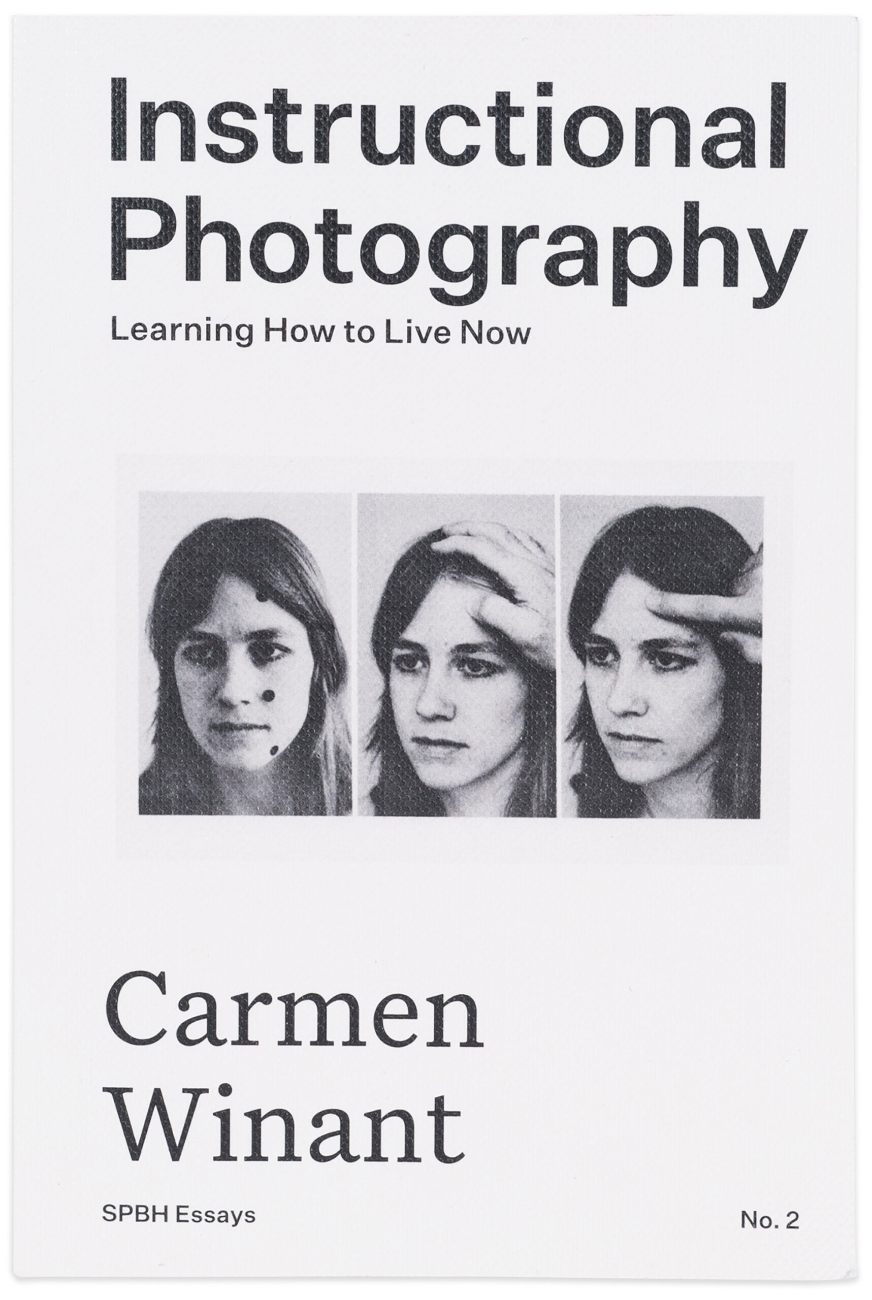
Cover of Carmen Winant, Instructional Photography (SPBH Editions, 2021)

Cover of Ryan Spencer: There Is No Light at the End of the Tunnel Because the Tunnel Is Made of Light (TBW Books, 2024)
Take Ryan Spencer’s There Is No Light at the End of the Tunnel Because the Tunnel Is Made of Light (2024), which sequences rephotographed neo-noir film stills into visuals for an unrealized movie to accompany the Afghan Whigs’ 1996 album Black Love. Reflecting this intricate premise, the photobook is modeled after a pulp paperback in scale (4 1/4 by 7 inches) and design, with a limited color palette of black-and-white images and red-tinted page edges. But the photographs would lose registration on cheap paper, so Schiek asked, “What if we use a paper that’s referencing pulp paper, but it’s semi-coated to accept photographs?” The final result looks much lighter than it is, lending a surprising weight to the dramatically lit photographs.
There Is No Light is not the first photobook modeled after a cheap paperback: In 1955, Roy DeCarava published a series of photographs of Harlem alongside fictional text by Langston Hughes in a small softcover titled The Sweet Flypaper of Life (recently reissued by David Zwirner Books). The book was a massive commercial success and remains one of the greatest photobooks of the twentieth century —but DeCarava was shocked at the small scale at which Simon and Schuster had reproduced his images. “I knew that it was not supposed to be as large as the usual book of photographs,” he once said in an interview, “but somehow I still expected a big, glossy book, with my photographs lavishly laid out.”
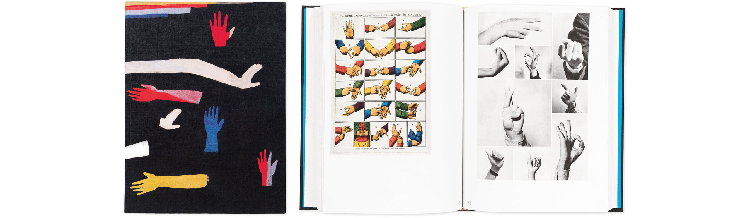
Cover and spread from Cécile Poimbœuf-Koizumi and Stephen Ellcock, Jeux de mains (Chose Commune, 2022)
“Small books might be cheaper to produce than larger ones, but artistically, they can be much more demanding to make, and to make sense of,” says the photography historian David Campany. “Every image and every design decision counts. But when a small book works, it really works, with an economy of means that can be profoundly rewarding.” Some examples of those that “work,” in Campany’s estimation, include Jacqueline Hassink’s The Table of Power (1996), whose diminutive form contrasts with the enormity of its subject matter (the boardrooms of some of the largest corporations in the world); Gallimard’s “tiny and perfect” 1931 monograph for the pathbreaking modernist photographer Germaine Krull; and “the best-selling photobook of all time,” the passport-size Point It: Traveller’s Language Kit (1992) by Dieter Graf.
The modern coffee-table book originated in the 1950s. “Coffee-table books had come to mean large, handsomely bound art books, picture collections, and various kind of picture-text combinations that were intended to be evidence of culture when displayed on living room coffee tables,” John William Tebbel wrote in A History of Book Publishing in the United States (1972). “Where once they had been read, they were now considered to be only display pieces.” But if the coffee-table book hastened the commercialization of photobooks—once popular vehicles for social commentary—it also offered a more accessible way for people to bring art into their homes.
While coffee-table books have a place in mind, small photobooks are often designed toward a specific reading experience. “I think small books feel more digestible,” says Ben Denzer, a book artist and designer who has made many books of unusual sizes and shapes (including a roll of toilet paper and ketchup packets). “Maybe they also feel more useful. I’m thinking about guidebooks and other small books you bring with you to places,” he notes. Denzer points to the influence and ingenuity of the Dutch designer Irma Boom, without mention of whom any piece on small books would be remiss. “I read Boom’s mini Biography in Books (2010) all at once in Madison Square Park on a sunny day,” Denzer recalls. “My eyes hurt for a while after.” Boom’s book (1 1⁄2 by 2 inches) documents her expansive career in almost a thousand tiny pages, giving it an almost comical thickness.
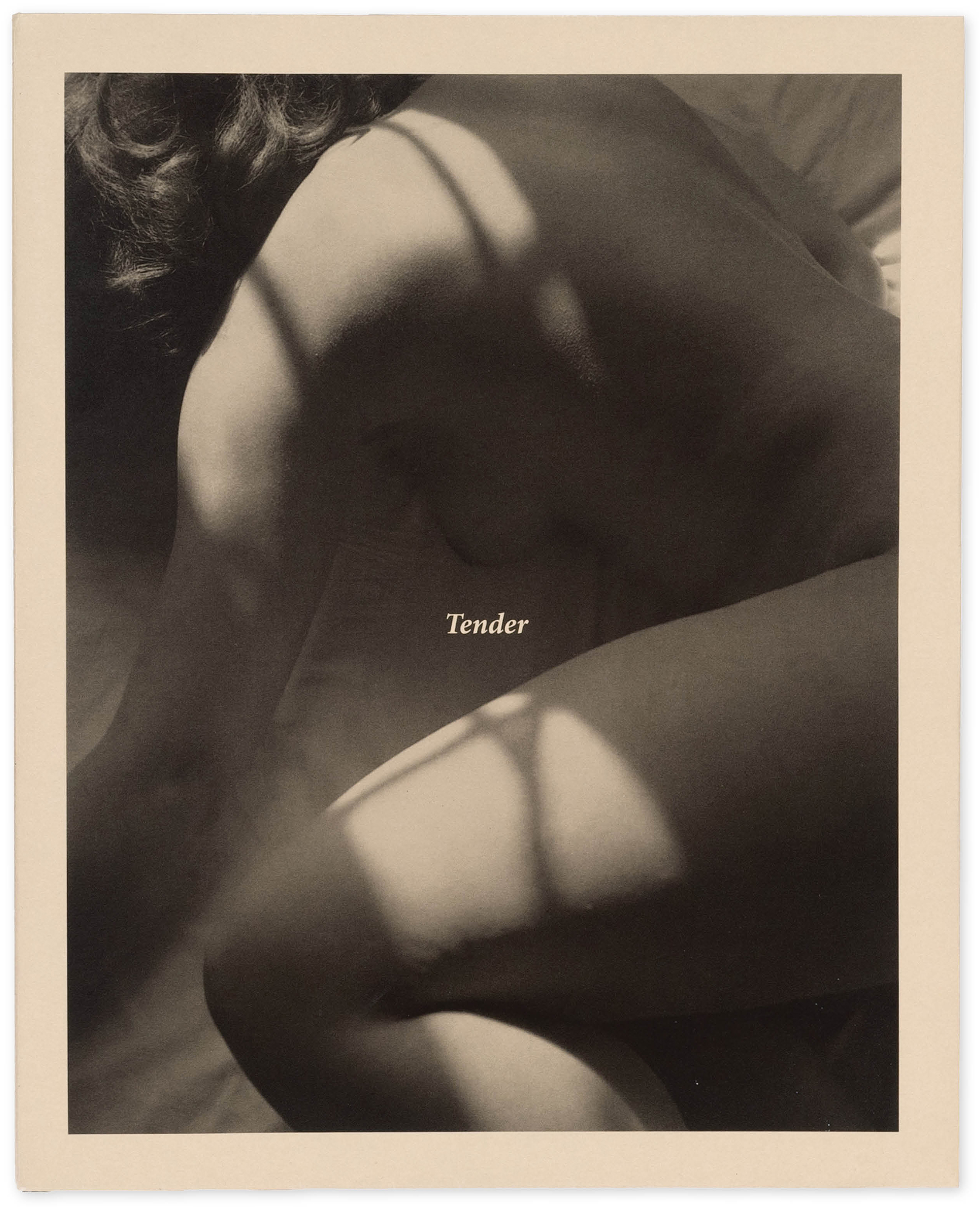
With a sturdy softcover, Carla Williams’s Tender (TBW, 2023), a slim book smaller than the laptop with which I currently write, is filled with mostly black-and-white images, printed on heavy matte paper, of the artist’s own nude body. When I received the book in the mail, I was surprised by its satisfying heft.
“I remember very clearly her saying, ‘I would love it if it was something that lived next to the bed,’” Schiek, who designed and published the book, recalls Williams telling him.
Shala Miller’s Tender Noted (Wendy’s Subway, 2022), another book about the body, combines photographs, film stills, and short poetic texts in a softcover with a tipped-in image. “I referenced the size of an average journal notebook to capture that intimacy,” explains Kyla Arsadjaja, the book’s designer. Arsadjaja also designed another book for Wendy’s Subway, Na Mira’s The Book of Na (2022), an even smaller little red book replete with grainy black-and-white abstract photographs, typewritten entries, and scarlet page edges.
“Scale and the form are decisions that a reader can feel before they even open the book,” notes Denzer. In many cases, it is the scale of small photobooks that encourages readers to open them. Their private feeling is much of the appeal. And in the age of smartphones, where the power of an image is not determined by size, more and more publishers are welcoming this opportunity to make photobooks meant to be held and, most important, read.
This interview originally appeared in Aperture no. 257, “Image Worlds to Come: Photography & AI,” in The PhotoBook Review.