Designing something beautiful is one thing. Designing something that is also beautifully functional is a rarity. Why has it been left to the minnows to show the big boys how it’s done?
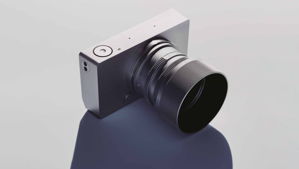
Sigma has just unveiled the remarkable BF, a gorgeous, clean-lined full frame camera that has taken minimalism beyond what anyone thought possible. It features a large LCD on the back (notably, one that doesn’t articulate or fold out) and a control dial. Nothing strange so far. The physical buttons, however, are something a bit different. One of the three is for power, leaving just two buttons for everything else. It’s a bold move given that, unlike the Hasselblad X2D, it doesn’t hold back on the video features. Clearly, it’s not for everyone, but there’s nothing else like it on the market.
You can make a similar argument for Hasselblad. The Swedes have a sense of style like no other, as their furniture design (and prices) will testify, so it was no surprise to see the company create an interface that made the shortcomings of almost every other camera on the market painfully clear. Only Leica comes close, but again, they don’t have to worry too much about video functionality.
You can get an idea of the menu on the BF in this short video from Gordon Laing. Sigma has given the industry a lesson in minimalist design, not just with the clean lines of the aluminum body but also by creating a menu system that doesn’t make you want to gouge your eyes out with a fork.
Where Is the Japanese Design Ethos?
Photographers have grumbled about menu systems for years, and manufacturers were content to let these complaints go largely unanswered, feeling no real pressure to make people’s lives easier. For years, we’ve been punished by ugly, confusing layouts, with Sony apparently determined to produce the most labyrinthine and offensive menu system its developers could muster. Photographers’ sensibilities simply didn’t deserve consideration—pick a horrific font, stick white text on a black background, choose a hierarchy by throwing broken darts at a list of weirdly abbreviated terms, and then forget about it for ten years. The logic was that cameras could be thoughtfully designed, but the menu systems could remain a shambles. Given how this contradicts the Japanese design ethos, I’ve long been dumbfounded as to why so few seemed to care about this.
Five years ago, I asked whether it was time for manufacturers to ditch buttons and dials and just use a massive LCD touchscreen instead. The comments were a resounding “no freaking way,” which makes sense for most cameras for two reasons: first, it’s not practical, however good a touchscreen might be; second, people like buttons, as further suggested by Sigma’s use of haptic buttons on the back of the BF. Getting rid of buttons makes no sense for the overwhelming majority of use cases, and yet minimalism has its place.
Photographers Deserve Better
Every time I moan about camera menus and poor design, there are people in the comments saying that it doesn’t matter and that once you’ve set up your camera, you rarely have to dive into it. For some, the experience of using a tool doesn’t matter, but for others, like me, the feeling of using something beautiful enhances the image-making experience and shapes the way I create photos. Some camera manufacturers get this; others don’t. Sigma’s line of lenses started to give a hint of this a few years ago, understanding that a non-mechanical aperture ring doesn’t have to feel non-mechanical.

Of course, a tool is a tool; if something is functional, that’s often enough. And, to a degree, those who don’t see any value in pleasing design are right. However, just because cameras can be ugly doesn’t mean all cameras have to be ugly. Simply because menus can be a horrific pit of abbreviations, gaudy colors, and badly designed icons doesn’t mean we don’t deserve better. Thank you, Sigma, for showing us what’s possible.
As usual, let me know your thoughts in the comments below.