The total fertility rate is commonly confused with the eventual number of births per woman. This can result in misinterpreting the impact of policies and trends over time.
When people talk about trends in fertility, they often use a single metric: the total fertility rate (TFR). It seems straightforward — after all, it’s often described as the average number of children per woman. But while TFR is a widely used metric, it’s not as simple as it sounds.
A common mistake is to think of the TFR as a prediction of how many children women will have on average over their lifetimes. That’s not the case. In fact, the TFR can decline even when the eventual number of children per woman stays the same or even increases.1 And the opposite can happen, too — the TFR can rise even when the eventual number of children stays the same.2
In this article, I explore why this can happen. I explain why the TFR doesn’t always mean what people assume and how to interpret it correctly. Understanding this can give us a clearer picture of the average number of births per woman, trends over time, and the impact of policies.
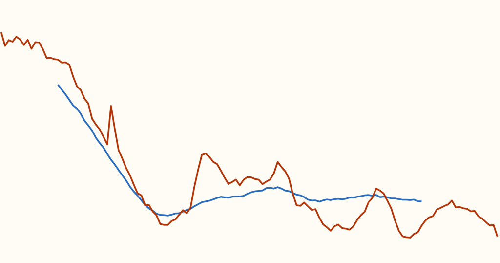
In the chart below, I’ve compared two metrics: the period total fertility rate and the completed cohort fertility rate, which is the eventual average number of births per woman in each birth cohort.
I’ve shown the data from Sweden, which has the longest time series of data.3
In the chart, the completed cohort fertility rate is given by the woman’s birth year plus 30 years. This adjustment reflects when women born in a particular year would reach the age of 30 — roughly the average age of childbearing for Swedish women during this period.4
As the chart shows, fertility rates in Sweden fell in the late 19th and early 20th centuries, regardless of which metric we look at. However, the two metrics have diverged since the mid-20th century. While the total fertility rate has had several large rises and falls, the completed cohort fertility rate has been much more stable.
But why can the two metrics differ so much? Why can the level of period total fertility rate be misleading about the eventual number of births? To answer these questions, I’ll introduce each of these metrics and how they are calculated.
Here, I’ll explain the two different ways to measure fertility: the total fertility rate and the completed cohort fertility rate.
I’ll start with the cohort measure of fertility, which is more straightforward.
Completed cohort fertility rate
The completed cohort fertility rate (or simply the “CCFR”) is the average number of children born to women in a specific birth cohort across all their childbearing years.
A birth cohort includes all women born in the same year, and the completed cohort fertility rate is calculated after a cohort of women has completed their childbearing years.6
A simplified version of this metric would be to calculate the total number of births divided by the total number of women, for women born in a particular year — in other words, the average number of births per woman.
However, not all women survive until the end of their childbearing years, and the population size might change due to migration. This is why, in practice, the cohort fertility rate is calculated with annual data instead.
For example, if we consider women born in 1990, we would calculate their completed cohort fertility rate by calculating the number of births per woman each year among women aged 12 to 55 years old and then calculating the sum total.7
It’s not necessary to follow the calculations here step by step, but if you are interested, I’ve shown them in a diagram below. The diagram has one simplification to make it fit: I’ve compressed their childbearing years into only five years.
Now that we’ve looked at a hypothetical example, let’s look at the actual data.
The interactive chart below shows the cohort fertility rate for several countries. Note that the horizontal axis refers to the women’s birth year, not the year when they gave birth.
You can see the period of the “baby boom” in the United States, where there was a rise in the completed cohort fertility rate for women who were born between the late 1910s and early 1940s.
You can click the “Edit countries” button to explore the data for other countries.

Total fertility rate
The period total fertility rate, often simply called the total fertility rate or the “TFR”, is the most commonly used metric.
It doesn’t require waiting for the entire cohort to complete their childbearing years before it can be calculated.
Instead, it is a snapshot of fertility rates in one particular year. It is the average number of children born to a woman if she (1) lived to the end of her childbearing years and (2) experienced the same age-specific fertility rates throughout her whole reproductive life as the age-specific fertility rates seen in that particular year.
If you want to see how it’s calculated, I’ve shown that in the diagram below.
While the previous diagram followed one birth cohort over time, this diagram looks at multiple cohorts in one particular year.
In this hypothetical example, each cohort has the same number and timing of births as the previous cohort. For this reason, the total fertility rates stayed constant: in each year, the fertility rate was 2.0.
What does the data for the total fertility rate actually look like?
The interactive chart below shows it for the same countries we considered before.
As you can see, the trend line often fluctuates greatly. This is because the total fertility rate is affected by the timing of births in each birth cohort, such as delays in childbearing.
As a consequence, there are sharp drops or spikes in certain years triggered by particular events. In Spain, the chart shows large fluctuations during the Spanish Civil War and World War Two, when births were delayed in certain years.
Another example is Japan, which saw a sudden drop in fertility rates in 1966. This was because of cultural beliefs that children born that year under the “fire horse” astrological sign would bring bad fortune. Many parents opted to have children either a year earlier or later.

With data from Sweden, we’ve already seen how the total fertility rate can change while the completed cohort fertility rate stays constant. The same pattern is also seen in other countries, such as the United Kingdom and France.8
But why?
Here, I’ll take you through a few examples to see why the volatility of the two metrics can be different.
Let’s take an example. Following the previous examples, I’ve visualized this effect in diagram form as well.
Imagine that an event affects many women at a particular time. For example, a natural disaster, pandemic, or war might affect childbearing decisions for many women across age groups in a particular year.9
In the hypothetical example, half of the women who planned to have children in 2023 decided to delay those births to the following year — except for those in their final year of childbearing, who decided not to wait.
In this example, the total fertility rate dropped to 1.1 in 2023 because the women who were delaying children didn’t have births that year, and their birth rates suddenly dropped in that particular year.
However, the women who decided to delay their births in 2023 compensated by having these births in the following year. Now, the fertility rate spiked to 2.9 in 2024.
Although the total fertility rate suddenly dropped and then spiked, the completed cohort fertility rate remained constant: in the end, they had the same number of children.
Let’s take another example.
What if there’s an event that affects people when they reach a particular age, regardless of their birth cohort?
One situation we can imagine is a change in the years of schooling. Say, if there was a sudden increase in the mandatory years of schooling.
Imagine that the education system changed for women born in 1994 or later: from then on, children had to stay in school for an additional year.
The diagram shows what might happen.
In this hypothetical example, half of the women delayed having their first births early on. They delayed those births until the following years.
The total fertility rate dropped slightly to 1.9 in 2023. The following year, it dropped a little further to 1.7 before climbing back up again to 1.9 and then 2.0.
Again, although the total fertility rate dropped and then returned, the completed cohort fertility rate remained constant: by the end, they had the same number of children.
There are two ways that fertility rates can change over time. They’re described as “tempo” and “quantum” effects, and I’ve illustrated them in the diagram below.
The diagram shows the fertility rate by age.
As you can see, a tempo effect is a change in the timing of childbearing. For example, women may delay having children. Alternatively, they might have children sooner than previous generations, which would also be described as a tempo effect.
Meanwhile, a quantum effect occurs when women have a different number of children. For example, women may have fewer children than in the past or more children (such as during the baby boom).10
A decline in the fertility rate at early ages of a particular birth cohort may not necessarily tell us about their eventual number of births because it can initially be unclear whether there is a tempo or quantum effect — in other words, whether births are being delayed or won’t occur at all.
The total fertility rate is calculated in such a way that tempo effects (changes in timing) can resemble quantum effects (changes in the number of births), if the total fertility rate is interpreted as the actual number of births per woman.
Of course, in reality, both can occur together: the timing of childbearing can shift, and the number of children can also change.
Let’s explore how these patterns look in real data.
This is shown in the interactive chart below.
It shows both when women give birth and how many children they have at each age. For example, a value of 0.1 at the age of 25 would mean that 1 in 10 women of that age gave birth that year.
In Sweden, for example, the curve has shifted to the right: younger generations of women are having children later than in the past, but this hasn’t led to a drop in the average number of children per woman.
In Spain, the curve has shifted and dropped. Women have children later than in the past and have fewer children at those ages.
You can explore the data for other countries by clicking the “Edit countries” button.
In the chart, the total area below each curve represents the total number of births that women of each generation had.
This is equivalent to the completed cohort fertility rate for that birth cohort.
We’ll use another chart below to display this total more clearly.

Below, you can see the cumulative fertility rate by age: it displays the number of births women have had up to a given age. The final value at 55 years old is the completed cohort fertility rate.
Now you can see that in Sweden, although the curves are pushed towards the right (meaning that childbirths have been delayed), eventually, each cohort reached a cumulative fertility rate of 2 births per woman. This reflects a tempo effect but not a quantum effect.
This looks different in other countries: in Spain, the curves have also been pushed towards the right, reflecting delayed childbirths, but they reached a lower point at the end, which reflects a tempo and a quantum effect.
Japan’s curves look similar to Spain’s — with a delay in childbearing and a decline in the eventual number.
The United States saw a large increase in cumulative fertility rates, corresponding to the baby boom. Only after this did the curves start to shift rightwards as childbirths were delayed. These post-baby boom cohorts also experienced a large quantum fertility decrease to just 2 births per woman.
Another thing to note is that we can roughly predict the completed cohort fertility rate when the curve has leveled off.

As we’ve seen, the period total fertility rate can be quite different from the eventual number of births per woman.
We need to be careful when interpreting a short-term decline in fertility rates — it can initially be unclear whether childbirths are being delayed or if they won’t occur at all.
Similarly, a short-term rise in fertility rates could reflect the end of a delay in childbearing11, rather than a rise in the eventual number of births per woman.
In sum, the total fertility rate can decline because of changes in the timing of births in each cohort.
Acknowledgements
Max Roser, Hannah Ritchie, Edouard Mathieu, Julia Rohrer and Ilya Kashnitsky provided valuable feedback that helped improve this article.
Cite this work
Our articles and data visualizations rely on work from many different people and organizations. When citing this article, please also cite the underlying data sources. This article can be cited as:
Saloni Dattani and Lucas Rodés-Guirao (2025) - “Why the total fertility rate doesn’t necessarily tell us the number of births women eventually have” Published online at OurWorldinData.org. Retrieved from: 'https://ourworldindata.org/total-fertility-rate-births-per-woman' [Online Resource]BibTeX citation
@article{owid-total-fertility-rate-births-per-woman,
    author = {Saloni Dattani and Lucas Rodés-Guirao},
    title = {Why the total fertility rate doesn’t necessarily tell us the number of births women eventually have},
    journal = {Our World in Data},
    year = {2025},
    note = {https://ourworldindata.org/total-fertility-rate-births-per-woman}
}
Reuse this work freely
All visualizations, data, and code produced by Our World in Data are completely open access under the Creative Commons BY license. You have the permission to use, distribute, and reproduce these in any medium, provided the source and authors are credited.
The data produced by third parties and made available by Our World in Data is subject to the license terms from the original third-party authors. We will always indicate the original source of the data in our documentation, so you should always check the license of any such third-party data before use and redistribution.
All of our charts can be embedded in any site.